My basic process for abstraction includes a number of discreet techniques that are not immediately obvious on the page, and will often get lost in the fray, so to speak. In order to get a better grasp on what I am really doing, I have been doing numerous line experiments to isolate and identify my own techniques. For this, I have drawn a helpful diagram of four of the most frequently used techniques.
I will now go through them in order, and explain how each of them works.
Tunnelling is one of the more obvious techniques. Where a line ends, only to reappear elsewhere along its logical path, making it appear as if it ‘tunnels’ behind or under whatever is there, despite being entirely flat. This is a simple way to make images more 3D. This line is most often made early on, as a base for other lines to work on.
Lacing is possibly my favorite of these techniques, because it treats the line like a thread, allowing it to coil around another line. This line is made in spite of the existing lines. Careful users of this technique will alternate the line they draw, allowing two or more lines to tangle and alternate between the foreground and background.
Shadowing is probably the simplest of all these techniques. You draw something, then you draw its shadow. The real technique here tends to be in the direction of the shadow. Being completely unconstrained by reason, a line can have all sorts of shadow lines, going in all sorts of different, conflicting directions. The shadow can be on the other side of the page, for all it matters. The basic function of shadowing is cohesion. A line is more ‘decisive’ when backed up by other supporting lines, it becomes more essential to the work.
Perpendiculars are just what they sound like, line interactions that are perpendicular. Where lacing lines would generally interact at a sheer, tight angle, they can, with this technique, interact at a harsh 90 degree angle. This is becauseI cannot think of something more incongruous with a piece of art full of smooth curves and parallel lines; perpendiculars are used to add an element of discord to a piece of art. They are the harsh line intersections that stand out.
In recent times, I have done a series of line experiments aiming to use all four of these techniques. Hopefully now that I’ve made this technique guide, it will be easier to identify how I am going about composing these drawings.
At the beginning of this module I intended for my work, labelled then as architectural abstraction, to go in the direction of a sort of portraiture. This is not in the traditional sense of portraiture, but in the sense that the framing of the abstraction was often like that of a human portrait, or otherwise based on the human body. I did a number of experiments that began with a human form, then elaborated on them. The aim here was to play off of the connotations of poses, seeing how the shape of the human body can suggest certain other shapes, and motions, and so on. Where many artists would focus on perfecting portrayal of the human form, I see this as secondary. The human form in my work has always been a foil; a framework on which to compose the rest of the piece. While a human form is often the ‘centerpiece’ of the scene, it is not the purpose of the scene. I had been unsure, at the start of the year, of what the final culmination of this years efforts would look like, and, not wanting to seem rudderless, I asserted that perhaps my ‘final piece’ would be made up of a series of surreal ‘portraits’, like this one:
‘evacuate soul’
I was glad, however, when I was approached about doing the Pachamama commission. I had already planned on drawing a piece similar in content to the proposed idea – a woman walking barefoot in the forest. This gave me direction – a task that could not easily be changed by my own fleeting wills – and something grandiose to work on that would occupy, for me, the role of ‘final piece’ to finish off this degree with. The task also provided me with an opportunity to flesh out various techniques, practice my lighting skills, and so on. However, it was also requested that the piece be coloured. One can easily compare my coloured work to my grey-scale work and see that I am clearly more capable of achieving depth in the greyscale work. This is largely down to limits in my colour palette, as much as I have expanded it greatly since previous assessments, and an often frivolous and improvisational colouring technique tends to get in the way more than it helps. This is something that I am continually trying to improve on in my practice, and experimenting in greyscale has helped a lot with this. At the same time, I have had concerns about my practice becoming too narrow, as the tendency is often to repeat techniques that I think have worked, which can get in the way of innovation. To combat this, I have composed a number of more illustrative, and less surreal, drawings, like the one below, that serve a variety of purposes.
The Menagerie
Pieces like this have far less logical inconsistencies in terms of line interactions than my more abstract work. One function that works like this have is in demonstrating to a potential employer that I am capable of illustrating things to a reasonable degree of accuracy. Having pieces like this in my artists portfolio are useful for demonstrating range, and that I can work around a coherent idea, where many of mine are incoherent. In the future, if I attempt to get a foot in the door with a publisher as a freelance illustrator, pieces like this will probably help. In trying to keep my work interesting, and prevent it from stagnating, I have tried to be rather strict with myself about when colour is appropriate to use. In the future I am sure I will be doing more experiments where a grey-scale piece has a small amount of colour – and working my way from there.
At the start of the year, I would never have guessed that I would be working on a huge piece again, when only the year previously I had told myself not to do it again. In second year, when I was working on Tackling the Godhead I repeatedly had to affirm to myself that I was not going to do this again for a while at least, because it had done such damage to my already arthritic hand, but who could turn down such a commission? As my hand pain has worsened over the past few weeks, I feel the urge to remind myself again, not to do pieces of art this big, simply because it isn’t healthy or sustainable. Frankly I currently consider my work on the small scale to be plenty detailed, and work on the large scale to be, well, overdeveloped at times. For every pen line I put down on the Pachamama, there were a handful of pencil lines first, then coloured lines after, meaning that the actual work that went into the piece is astronomical – as for every square inch the objects have to be drawn at least three times.
I am not disheartened by what I have and haven’t learned on this course. University has been an opportunity for me to develop my practice, and I would certainly say that my practice has developed. I sometimes wish I had had more guidance, but that is only down to my own poor attendance in the past, and my own shortcomings as a student. I do, however, think that what guidance I have been offered has been useful beyond measure, as I am so often wrapped up in the fog of my own process that simple things seem less obvious.
It seems strange to me now, that when I began university I was studying creative writing and english literature. Now I have formed such a great distance between myself and this side of academia, it seems absurd that I would want to study english at all. Perhaps I shouldn’t have listened to the advice of my sixth form english teacher. At the time, I had only just rediscovered my enjoyment of art, and was staunchly set on oil painting. Now, only four years later I have been exhibited twice, sold about twenty pieces of art, and could not be more set on doing art for the rest of my life. When the nihilists say life is meaningless, and you have to construct your own meaning, I believe I am doing so, with art.
Since I began taking an interest in architecture, I found that simply drawing a building of some kind was rather boring. I wanted the buildings to have a hook, a weird twist to them, that made them surreal and otherworldly. Last year, I had begun looking into ‘buildings atop giant animals’ as a concept, and drew a tortoise with a castle on its back. This year, i began with a stylized pangolin, and, in keeping with the current world events happening, drew a floating quarantine island above a small city, on its back. This is also where I began really drawing black and white objects on a featureless white plane. I have done this purely because, when a drop shadow is drawn, it makes the object jump out of the plane, and achieve a sort of 3D effect that I have been seeking for a while.
The above piece, titled Set and SETI, is probably the most successful of my ‘buildings in strange places’ experiments. This is largely down to the use of one point perspective when drawing the ‘cart’ that the terror bird is pulling, as well as some of my better shading work on the satellite dish allowing the buildings to ‘pop’ a bit more. While drawing this piece, I was stumped for what to put on the floating, tethered rock, when I realized, in a heady fervor of pretentiousness, that we are on a floating rock of sorts, which brought me towards the search for extraterrestrial intelligence (SETI) that uses the Allen Telescope Array to look for signs of life outside of earth. Once I figured that it was going to be a huge satellite dish on the rock, the title came easily. Set is the Egyptian god of war, chaos and storms, SETI i have already defined, and the term ‘set and setting’ is often used when describing ‘the ideal conditions for a drug trip’. A triple entendre, my favorite kind of title.
Continuing the vein of buildings atop animals:
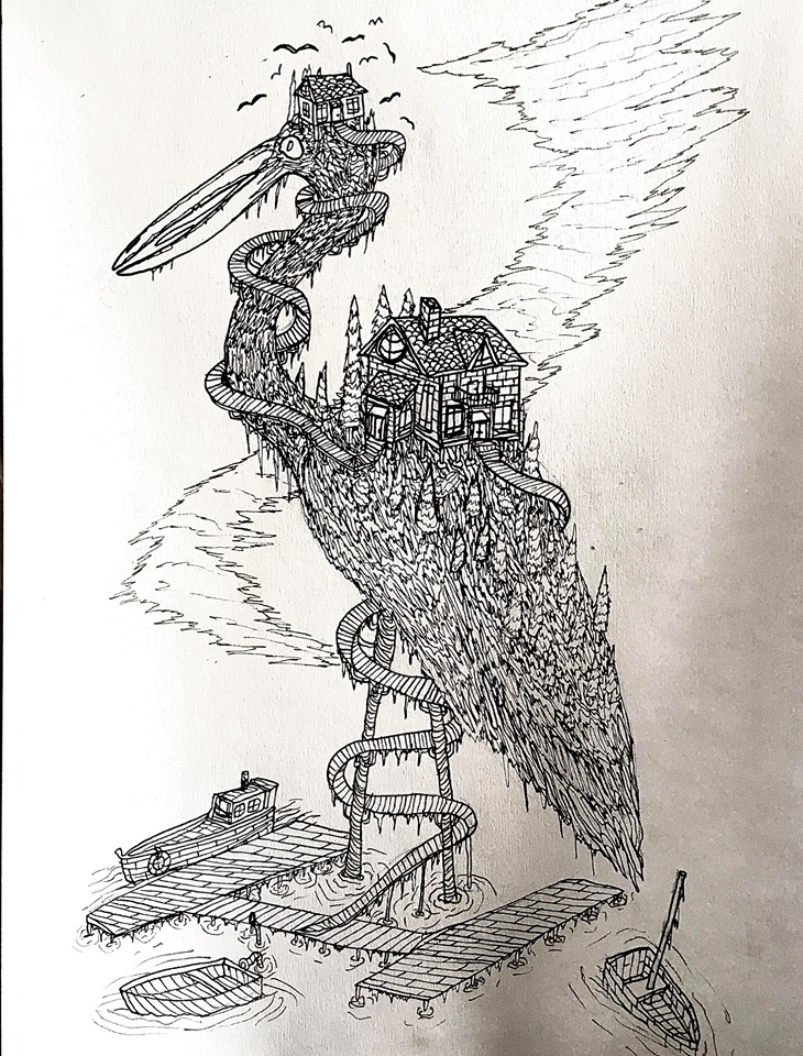
Here is my Heron Island, with some of the most logically incoherent stairs ever. I decided in this instance to see what it would be like without the usual drop shadow. It’s interesting, but I have considered revisiting it for some shading.
This is probably my favorite drawing I have done this year, and I have thought about doing a whole interconnected set of towns atop the frozen bodies of breaching whales. In this instance, I wanted to keep a vague sense of ‘realism’, so tried to design a town that would ‘logically’ fit on the underbelly of a whale. A single street goes through the middle of the houses, leading to a lighthouse on the crest of the whale’s head. I wanted it to look like the whale had breached and then had suddenly been frozen. I used the same technique I’ve used in the past for drawing vines to draw icicles hanging from every available surface. There’s something about the absurdity of this one that I just love. My mother thinks I should write and illustrate a fantasy kind of story around these buildings on animals.
This piece, “The I Scream Van” is probably the least successful out of all of these animal/building experiments. First of all the animal, which I tried to improvise, came out looking like a bad render of a monster in a low budget sci-fi movie. Not good. Its arms and legs are tenuously drawn. It was meant to have the forearms of a gorilla and the back legs of an elephant, but it just looks a bit clunky. I was at a loss for what put on/in the caterpillar-tracked thing, and eventually settled on a huge mound of soft-serve ice cream. It was really the only way I could redeem the piece – hinging on the double entendre in the title.
This piece, titled ‘Snail Mail’ is another one that I would put on the ‘least successful’ end of the spectrum. While I had fun drawing the airship and flying monster, the shadows proved to be nearly impossible for me to draw accurately, because the airborne objects are not clearly in the foreground or background, so I had to kind of make up their shadows as I went along, leading to some pretty weak shadow connections. On another note, god isn’t that little person just terribly drawn? I really need to work on my attention to detail with stuff like this.
I consider this piece, “Bumble cottage” to be one of the more successful instances of this concept. This is probably down to keeping it simple, not overtexturing the wings, and so on. This is probably one of the better instances of shading recently in my work, although if you look closely, the man sitting on the sofa really looks terrible.
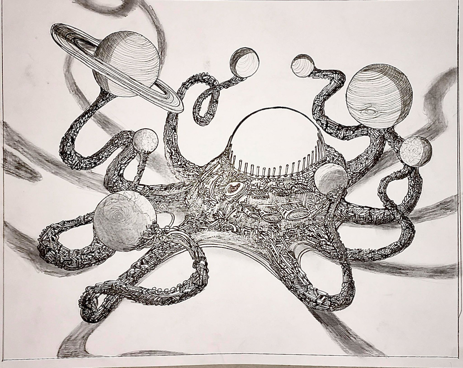
While this one does not have any buildings in it, technically. I feel it is still in the same vein as the aforementioned pieces. While looking online at clockwork orrerys, something that I’ve always wanted to own, I realised that, given that Pluto is no longer considered a planet, an orrery could technically be built to look like an octopus, as there are eight bodies considered planets in the solar system. As soon as this connection was made I had to draw it. The real challenge here was in the lighting, because I wanted the sun to be the light source, is it is in reality. In order to do this I mapped lines radiating from the sun to each of the tentacles to try and see if i could project their shadows properly on the white plane. As much as my shading absolutely has room for improvement, I am still happy with the outcome.
Moving away from animals now, I have drawn a couple buildings in independently strange places:
This piece, “Falling Water” (yes its based on that Frank Lloyd Wright house) is another one that I would consider very successful. I am just absolutely in love with the idea of a building held up only by a waterfall. In this instance I decided to leave the water untextured, for a sense of cleanliness, and drew the drop shadow of the whole ‘property’ with black sharpie. There are only three small problems I have with this piece. Firstly, the tree is not included in the shadow, despite hanging over the edge of the property. Secondly, a window on the left side of the building was drawn using the wrong perspective lines, meaning that it angles incorrectly for the wall its meant to be on. The third and final problem is that technically the shadow is drawn completely wrong. The edges of the shadow should be following the same perspective lines as those on the building, but instead they are actually parallel to the lowest of those lines, because when I tried it the other way it honestly didn’t look as good.
This piece, “The Harbormaster’s House” was quite fun to draw, and quite simple when it came down to it. All I wanted was a house built on the crest of a wave, and I think I pulled it off. The real hook of this piece is that you can see under the wave, and see that it is not being supported in any way.
Well well well, here it is, it’s finally done. Five months in the making. The largest piece of art I have ever done. None of this scaling up the line thickness nonsense, I’m getting in there with 0.2mm fineliners to make sure even the least visible parts of the piece are stuffed with detail.
Here is the colour scheme that I ended up using. It is much broader than the schemes I’ve worked with before, and the variation in tones between similar colors was a really helpful tool in creating depth and cohesion in the piece.
Lighting The basic rule of ‘warm forward, cold back” had to quickly be abandoned as I began the piece, otherwise there would have been too harsh a contrast between the foreground and background, where I wanted the transition to be smooth. Initially, it was rather easy to restrict my use of light colours in the foreground. I went in circles around the edge of the piece with dark purples, blues, reds and greens. The real challenge with this was in identifying what parts of the outer edge of the piece really were meant to be foreground. I had drawn the flora in such a way that there were meant to be gaps between some of the branches and so on, so that the jungle wasn’t as much of a ‘wall’ of trees. This is probably most evident in the upper right hand corner where I wanted the main source of light to be coming from. As you can see, the chameleon is vaguely silhouetted against the light yellows and oranges. Naturally, however, I did not want the foreground to be too dark, as it would obscure many interesting details and so forth. So I elected, about halfway through the colouring process, to begin moving outwards with the lighter colours, placing lighter oranges, pinks and greens on objects, leaves and so on that I wanted to stand out in the foreground. Because the light source is meant to be coming through the tree canopy, and because this diffusion through the canopy leads to a dispersed light source, giving objects shadows was a real challenge. For example, the shading on the female figure is a bit convoluted. I wanted the light to come around the side of her body, and highlight the back of her leg that was lifting in the ‘mid-step’ pose. However, creating shade behind her and underneath her lifted foot was really challenging, not only because it meant darkening the middle ground of the piece to a more foreground-level of light. As well as this, I wanted areas that were in shade to have less saturation than those in direct light. In order to convey this, I tried to use three shades of pastel blue that I had in my colour scheme more heavily in areas of shade. Unfortunately, with the medium of coloured pens on paper, there is no taking back any colours you’ve put down. I feel at times I may have made the shading on the figure a little extreme and one sided. An issue with this was that I was instructed to draw the figure clad in a ‘leather dress’, which is really difficult to draw as leather has a shine to it and a manner of rippling that is very hard to wing. While I am satisfied with how the figure came out, I feel that my proportioning was a little weak. I have often thought that I made her head a little too large, and her buttocks, which I was explicitly instructed to make larger, make her look a little more frumpy than I had intended. However, one aspect of the shading on the buttock area is really where this fell short of success. On the right side of her body, I was not able to lighten parts of the dress in the way I wanted to, so instead I had to darken the left side to create the sought after contrast. However, I was unsure of exactly how much light should come around the right side of her body, and I think maybe I overdid it. Unfortunately this means that her right buttock looks both bulbous and flat at the same time, which is not ideal.
Flying Fauna
There is a huge variety of flying animals and insects in this piece, predominantly coming from the right side of the piece. This became one of the most challenging aspects of this piece because of a number of reasons. First of all, so as to place them in the foreground, I had to draw all of the flying animals and insects before the entire background on the right side, so they wouldn’t be lost in the jungle, so to speak. However this meant that when I came to draw the foliage behind the flying animals and insects, I had my work cut out for me, because drawing a tree suddenly becomes a lot harder when it has to be behind a hundred tiny butterflies and the like. This became a problem again when it came to colouring the piece because everything airborne is meant to be largely in the middle ground, while the foliage behind them is similarly meant to be coloured as the middle ground. As a result, I decided to incorporate darker shades, like dark blue and purple, into the colour schemes on the birds and insects. I had to then be very strict with myself about not using these same colours when drawing the foliage behind them all, because otherwise they would all be indistinguishable from the foliage.
The Background I had no specific instructions about what the background of the piece should consist of, only that the woman should be walking uphill towards the left side of the piece. As it is meant to be set in a jungle, I figured an overgrown temple of some kind would be fitting. I had done several pieces in previous years dealing with the same kind of concept – ancient buildings overtaken by nature, just like I saw in Angkor Thom and so on. I figured out relatively early on that I wanted the temple to have a face, just like those in Cambodia, but I did not want the face to be a specific one, or cause speculation about whose face it is. To combat this, I decided to make it into three faces, each nested within the previous one, somewhat like russian nesting dolls. The three faces, from inside out, are meant to get progressively older, so as to represent the different stages of one’s life and so on. This can also be interpreted as an exposure of the infantile traits that psychedelic drugs can give an individual. It also suggests a sort of timelessness that I was keen to put into the piece. As well, the background was to be largely constructed of distant trees and hanging vines, a somewhat flatter surface than I had worked with in the foreground. This manner of drawing, coupled with the smoother set of colours I used to highlight the background, hopefully gives the piece a sense of depth, where a slight atmospheric haze distorts the background, that all distant things on earth are distorted by. I also made a conscious effort, while using very thin grades of fineliner, to make the objects in the background less well defined than those in the foreground, because the level of detail one would see in the foreground of such a scene should really be greater than in the background.
Endurance I have never before done a piece of artwork that has taken this long, nor been this large. I had to cut down a huge A0 piece of paper just to get the dimensions right, as it was meant to be basically a longer (length ways) A1 piece. I have previously done two A1 pieces, but they were both landscape and they were both down to my own volition. In this instance I had specific things I had to try to convey in the piece, specific objects, and a specific layout on the page. While this constricted what I was able to do to some degree, it still left a lot of room for creative freedom so I was not too bored by the endeavor. However, spending five months doing absolutely anything is a long time. Spending five months in the confines of one giant piece of paper was difficult, and I marathoned various TV shows during the process so as to keep me entertained during the more tedious parts of the piece. For reference, I managed to watch seasons 1-15 of Hell’s Kitchen, and many other shows and movies, while doing this piece of art. When I am not working on the piece, I made sure to have it somewhere visible to me, so I could scrutinize it from afar and constantly be assessing how to work the colours and so on. This got to the point that my girlfriend, who was quarantined with my family for a while, insisted on turning the piece around when I wasn’t working on it, because she kept catching me staring at it when we were meant to be doing other things. Now that the piece has been sold, and no longer leans against the wall in my bedroom, I find myself a little aimless without it. It was such a huge constant in my life that it now feels weird to no longer have it here. Even as I write this, I keep glancing around as if the piece is still here, intending to look at it for reference, before reminding myself that it is no longer here. I had a number of motives to work hard on this piece: it was my first proper commission, I was to be payed a hefty sum for the completed work, the recipient is a close family friend, and it will no doubt be seen by a large number of people. He even intends to have an ‘unveiling’ party after the quarantine rules are relaxed. More than any of these reasons, however, I had an insatiable urge to put every ounce of effort I could into this piece because I view it as my first act as a legitimate artist. I would never live it down if I had half-assed this piece, it would not have sat well with me over the course of the year. Even while my other modules suffered from my poor attendance, I was content (or as content as I could have been) alone in my bedroom, with no human contact for weeks on end, so that I could truly make this my greatest artwork to date. Frankly, as much as I may have romanticized my own art practice, dedicating such a significant amount of time to this piece of art made it a far more gratifying endeavor. It is the rare result of me actually putting 100% of my effort into something. As someone who was always told I had ‘potential’ in school, while doing what was always described as ‘the bare minimum’, it was nice to finally have something that I could seriously dedicate my time to. To go above and beyond what I have done before and push the boundaries of my style and methods was profoundly satisfying. While I do not consider this my magnum opus, as it seems a little premature in my career to be asserting such a thing, this is regardless the greatest work of art I have done. This was, at least to me, a prolonged, successful struggle of the highest echelon.
Going on from this Now naturally I’ve got my fingers crossed for getting more commissions in the future, but at the same time, I would love it if I didn’t have to do something this big for a long time. As much as the end product is certainly something I am proud of, it has come, as always at a great cost. I keep wondering that, if my time had not been so deeply occupied by this piece of art, I would have had more time for a social life at university. The same goes for last year’s big A1 piece, and the year before. I firmly believe that it takes a lot of discipline to become a great artist, and half-assing your work is a sure way to fail as an artist. For years now, I have dedicated as much of my time as possible to pursuing my art practice on my own. I have missed countless classes because of that potent excuse – I could just spend all this time on art (not to say that the pervasive mental health issues aren’t also a significant factor). When I first started really developing this art practice in first year (before I restarted my degree), I had friends in my building. Then, as my addictions became more severe, and my living situations became progressively worse, I apparently began retreating into myself. By my second attempt at first year, I had no friends. By my second year, I was in a painful and toxic living situation that pushed my mental health into the worst state it’s been in since I was suicidal during my GCSEs. Throughout all of this, the one thing that kept me occupied was my art practice. It has been the thing that brings me comfort and validation when I am alone for weeks and weeks on end. A simple idea has been at the forefront of this coping mechanism, and it absolutely is a coping mechanism. The idea is that, if I dedicate enough of my life, make enough sacrifices for my art, then I will succeed. I have a profound fear that, when I am not working on art, some unknown counterpart somewhere is hard at work, and they will succeed instead of me. Hence the work ethic. It’s important to note here that by success I do not mean fame or recognition. My success is only to be judged on whether or not I can support myself on my practice alone. We shall see.
When we talk about psychedelic art, one of the most familiar genres within the art form is the creation of mandalas. There is evidence of the creation of mandalas in East Asia as long ago as the first century BCE. They are often used in buddhist and hindu practices and temples, and are considered a pleasant form of decoration all over the world. Now I can enjoy a mandala like the next guy, they’re pretty and colorful and intricate. However, I do not think that they are worthy of being considered art – they are decoration at best and here’s why. Here is a mandala I took all of half a minute making on a mandala generator website:
As you can see, it looks pretty complicated right? Wrong. The work that went into this mandala is not even a circle:
In fact the actual drawing is not even a quarter of a circle. It is 1/5th of that. In total, to make a circular mandala, you have to draw as little as 1/20th of the circle, as it is repeated in all the adjacent cells. If a mandala should be considered art at all, then only a single segment of it should be. There is no art (lets say in this context artifice) being made when a computer idly repeats a drawn image twenty times. If I were to take a drawing of mine and copy it over a wall repeatedly like a bad repeated texture in a videogame, then should the wall be considered the art? I do not think so. The original piece should be considered the art.
And yet, we have all these artists wasting their time painstakingly drawing perfectly symmetrical mandalas by hand, when a computer can do what they do in literal seconds. It just seems so redundant. As if the artists are saying ‘instead of drawing something new, I think I’ll draw the same pattern repeated twenty times’. It is asinine and a waste of our finite lifespans. Another issue I have with mandalas is that I so rarely see ones that aren’t entirely decorative. All the lines tend to be simple geometric patterns that are kept consistent and mirrored all over the piece. If there was more of a trend towards drawing actual scenes or objects or unusual forms in the mandala segments it would be a hell of a lot more interesting. As someone with bad Carpal Tunnel and repetitive strain injuries from drawing, I physically wince when I see someone draw something so complex, yet so repetitive. Its like when I heard of an artist who spent years drawing a huge piece of art, only to burn it at the end. Yes well done on the social commentary, but what a waste.
This is something that I have discussed in the past quite a lot – how do we set the value of a piece of art? There are many schools of thought here that make it very difficult to come to an answer that people would widely agree on. So whatever, I’ll just come up with my own quantification of what makes value in art. We have the idea of a ‘prolonged, successful struggle’ which I have often found myself agreeing with, because the three criteria involved – length of time spent, technical difficulty, and ‘success’ of the piece – are pretty agreeable measures for value. However, the ‘success’ part of this is perhaps the weakest. Who is to say whether or not an artist has been successful? An artist could create one thing, falsify an intention other than the one they originally had, and claim the work as successful, even if it isn’t successful by their ‘real’ standard. What we can learn from this is that artists will place as much value as possible on their work. Notoriously a low income profession for the mostpart, it makes sense that artists would try and milk the value of their work, however, it does not mean that the piece has actual value. But then, what does determine value? If it isn’t a personal attribution of success, because the assertions of the artist are unreliable, then is it the attribution of success by another person? Again, no. Because someone might interpret a wildly inaccurate, yet elaborately substantiated, statement from a piece of art. A good example of this is the false analyses of Munch’s The Scream as a depiction of the eruption of Krakatoa, and the deafness of person in proximity to it. There’s no actual evidence that this is what the piece is about, but its a fanciful interpretation, that one might argue adds value to the piece. So then we can say that neither the artist or the observer can validly ascertain an artwork’s value. But then who can? It’s certainly not art critics or the auctioneers at Southebys. Simply put, it seems no one can, in any way, make an accurate interpretation of the value of a piece of art. That is, unless, we simply consider it labour.
If we view the creation of art as a labor skill, like bricklaying, carpentry, drywall removal, and so on, then we can ascertain value based off the amount of work the artwork took to make. Therefore the Mona Lisa, for example, is not valuable because of its supposed ‘mystery’ or status as a relic, it is solely down to the fact that Leonardo spent three years painting it. This brings me onto another thought experiment.
Say you were to give two artists one year to create a piece of art worth, say, £5000. Artist A spends the entire year drawing an elaborate piece of art in the vein of The Garden of Earthly Delights, spanning an entire wall, in minute detail. Then artist B spends twenty minutes mixing paint and doing three brush strokes on a canvas (looking at you howard hodgekin). At the end of the year you ask each artist to present their work. You would surely be dissapointed with the work of artist B, because no matter how bullshit-ridden their explanation for why it should be worth £5000 is, it’s plain to see that it should never be worth that much money. After all, artist A spent the entire year on the piece, where artist B only spend a half hour. If it was then your choice to buy one of the two pieces for £5000 would it even require thought? Artist A did significantly more work than artist B so should therefore have created a more valuable piece of art.
But then there is absolutely art that takes a long time which does not have clear value. Pretty much everything made by my man Damien Hurst takes a while, despite the efforts of his enormous work team, and yet it is totally vacant, dispassionate, and dull. So then we must conclude that it is not labor alone that produces value in art. Prolonged, yes,Struggle, yes.
Again the issue is the success of the piece and this is where we must, yet again, admit that art is entirely subjective, has no inherent value, and is only worth what someone is willing to pay for it. Yikes. Not a very objective measure now is it?
I have begun the laborious process of colouring the commission piece. So that its clear that I’m not just making it up as I go along, here is my plan:
Starting from the outside, just like with the drawing process, I will colour the foliage and everything in the foreground with a combination of dark colours (navy blue, dark purple, dark green etc) while using brighter ‘middle ground’ colours to highlight prominent features of the foreground, like the corpse flower in the bottom right, and chameleon in the top right. I have divided my selection of colours into three groups, darkest, lightest, and ‘middle ground’. This is in the hope that the foreground is the boldest, but not the lightest, because so that there is a clear distinction between front and back in the depth of the piece. This is a clear issue with the drawing of the piece in black and white, which is that it makes it very hard to distinguish foreground from background despite my efforts to use different thicknesses of pen to draw them. This is what makes me somewhat glad that I have to colour in the piece, as it gives me a ‘second chance’ of sorts to solidify the depth that I really want to convey.
I sent a few sample colour palettes to steve and he said he’d like a ‘soft green’ atmosphere with brightly coloured highlights, which is excellent because that’s exactly what i was doing already. My good friend mint green will be playing a prominent role in the piece, and hopefully ill be able to keep the changes in lightness and boldness between the foreground and background.
Following on from what I’ve written about capitalism and its negative effects on the art world, I must address the overly idealistic communist views that arise whenever someone goes ‘capitalism bad!’.
Everyone seems to think that if we somehow got that communist utopia going we’d all just be able to create and live leisurely and so on. I believed this naive idea for a while as well. However, the commune already has a painter. Human society is not balanced in terms of peoples interest in the arts. If we all the opportunity, a large majority of us would spend our time hedonistically creating whatever our hearts desired. But then we reach another problem, the hierarchies of art and how capitalism has created them. What determines quality or value in a society without money and art galleries?
In these strange oncoming-apocalypse times, I often wonder how the skills acquired by an artist would be treated if modern society were to collapse. In the hunter-gatherer anarchic sense, they are, at least on the surface level, totally useless. Painting, sculpting, drawing, printing and so on are all auxillary to the fight for survival. Being an expert painter will not help you hunt or gather better, or treat your wounds, or any other thing that benefits human life in the survival sense. So then why has art arisen as a commonplace and global phenomenon when it has no overt evolutionary function?
Well, maybe it does have an evolutionary function, just one that is quite discreet. In order to explain my speculation on this matter, I must first explain the evolution of the human penis. Humans are the only primates who lack a penis bone. In our mythologies, this has been translated into adam giving a rib to create eve, and other such references. However, the actual reason for the missing penis bone is quite straight forward – without something to aid in erection, the human male had to rely on the abilities of their circulatory system in order to even be able to reproduce. This aided the development of our strong and resilient cardiovascular systems, as men incapable (or less capable) of achieving an erection would be less likely to reproduce and pass along their ‘bad circulation’ genes. The lack of a penis bone was not a survival trait like the ability to hunt or avoid poisonous berries – it was a trait to aid in sexual selection, and benefit the ‘most useful’ gene carriers. This is paralleled in the way that human pheromone senses work. While our use of pheromones is very minimal compared to most other mammals, we do nonetheless use them. It has been recently found that people prefer the smell of someones sweat when their immune system is the opposite of their own. This sort of pushes people in the direction of reproducing with other people who have ‘complimentary’ but not identical immune systems. These sexual selection traits number in the thousands, but I believe auxiliary behaviors like art are certainly among them. The crucial part of this is permanence – if someone paints on a cave wall as they have all over the world throughout history, or carves a relief, or sculpts a little madonna, they are creating something which often (if not always) will outlast themselves. An early human could potentially see that another member of their tribe has certain skills in art and reproducing with that individual could benefit the tribe in three main ways. Art is, as I have said, a way to demonstrate the permanence of one’s actions. Permanence has the useful connotation of suggesting resilience which, when something long-lasting is created by a human, it may suggest that they themselves are resilient in a similar way, and therefore more desirable evolutionarily. The second function of art in this sense is to demonstrate higher cognition – conceptualizing art requires, at least at the surface level, some cognitive development. Reproducing with people whose brains are more advanced is beneficial evolutionarily. Now this comes close to saying ‘people who make art are superior’ – not the case. Our populations have such profoundly well developed brains that the advantages given to a skilled artist are no longer relevant. Now, with the biological playing field leveled, the only factors that produce a skilled artist are circumstantial and environmental. However, this brings me onto the third way in which art is a sexual selection sign. Simply put, being able to devote time to a pursuit that does not overtly benefit the survival of the individual or the group is a sign of advantages in survival – as the more free time an individual has – the more advanced their survival skills are bound to be.
Ok this bad boy has been driving me completely insane. I am pretty much done the lines on this one now, so the next stage is going to be to start coloring. But I figured i should reflect on how the lines were done and the successes and challenges of the process.
I spent a day messaging steve back and forth about how exactly he wanted the woman to be standing – looking over her left shoulder, walking uphill to the left, arms at her sides, and I had to redraw her in pencil like a hundred times before getting it right. This was the first step. Then I mapped out the golden ratio lines on the paper, to see where my focal points should be. I decided to have the background- the upper-middle-left – to recede into the distance at the center of the golden spiral, this would mean that the piece vaguely revolves around this point, and not the figure, as one might assume.
The first real step I needed to take after drawing the figure was drawing the closest foreground, namely things at the very bottom of the piece and a layer of branches and leaves around the outside of the piece.
It looked very sloppy for a very long time. The basic process consisted of doing a layer around the outside of the piece, starting with a 0.8 thickness fineliner, then moving inwards, using smaller fineliners in each layer, so that the features properly receded into the background. However, its not like the only thing I had to do in this piece was draw trees, leaves and vines, although I’ve had to draw them a lot. The actual features of the piece – the animals and so on – had to be drawn with the layers, as they belong to specific parts of the foreground and background as a result. Here is a supposedly exhaustive list of every fauna I put in this piece, in no particular order: Colorado River toad Parson’s Chameleon Goliath Birdeater tarantula Bull python Ring tailed lemur Northern flying squirrel Poison dart frog Saturniidae Moth Monarch butterfly Japanese tarantula wasp Honey bee Dragon fly Marine Iguana Hummingbirds Birds of paradise Mandrill Jaguar Bengal Tiger Pelican Hyacinth Macaw Scarlet Macaw Blue tit Ten-lined June beetle Ladybird Stag Beetle Blue damselfly Indian cobra Deaths head hawk moth Gaboon viper Giant African land snail Peacock butterfly Adonis blue butterfly Luna Moth Polyphemus Moth Amazonian giant centipede Malayan jungle nymph
While there is far more concrete fauna than flora, its worth listing the specific flora that I’ve included as well: Corpse flower Royal Ferns Swiss cheese plant Psychotria Elata (otherwise known as ‘hookers lips’) Monkey Ladder Liana Pigeon Orchid Rattan Palms Dandelions Psilocybin Cubensis mushrooms Amanita muscaria mushrooms liberty caps Agaric Honey fungus Banisteriopsis caapi vines Kudzu vines
Outside of these specific flora and fauna, all of the plant matter in the piece was improvised, based on the various needs of each area – a tree trunk needed here, a branch there, and so on. Funnily enough, you could probably argue that the bulk of the piece is made of one singe technique, hanging vertical jagged vines. This is an easy technique, one that adds a basic sense of vertical dynamism to the piece, and one that allows the fluidity of vines on vines on branches come across.
This is undoubtedly going to be one of the hardest aspects of coloring the piece, because I have already committed to the technique and, well, there’s no going back really.
The colouring plan in a basic sense is to have the most bold and dark colours, reds and greens and purples and so on, to be in the foreground. I am going to have to work in the same way I did when drawing the piece, foreground to background, so as to have a gradually receding gradient that becomes lighter and more pastel as it goes further back. I have procured two large sets of colored felt pens and fineliners and, while this is definitely going to take ages, I am confident that it will be doable. One of the main fears when it comes to coloring is making the piece too flat. If i am not strict enough with which colors go where then the piece will become far too uniform and the proper desired depth will not be achieved.
Psychedelic techniques This piece, more than anything I’ve done before, is meant to be decidedly and overtly psychedelic. So as to replicate or enhance (both, lets do both) the psychedelic experience, I wanted to fill the piece with as many psychedelic techniques as possible. Here I will run through a few examples.
Eyes eyes and more eyes
Here is a solid example of whats known as psychedelic replications. By using a Deep Dream algorithm, people can easily distort images into these trippy patchworks. However, the main trait shared between all of these is the abundance of eyes. Due to our elaborate facial recognition software, we are programmed to see faces everywhere, and the dominant feature of a face is a pair of eyes. As I have discussed before, when under the influence of psychedelic drugs, we are particularly prone to misinterpreting our sense data as full of human faces. So as to keep in line with this, I was determined to crowd the piece with pairs of eyes. They are drawn freely on trees and leaves and so on, but they are in particular found on the wings of practically every flying insect in the piece. I wanted that atmosphere of ‘eyes everywhere’ to be energetic, and not just ominous. I also decided to hide a number of specific faces in the piece, including the faces of two of the people steve did ayahuasca with (taken from a photo he sent me), his own face (twice) and the faces of his son, daughter, and wife. These have all been spread across the image so as not to draw attention to them. Personally I just thought it would be funny for steve to be staring at the piece and stumble across the face of one of his family members, and so on. I have also included a few animal skulls – human, rhesus monkey, crocodile and gazelle. Why? because death. Ayahuasca is, in many vague ways, linked to death. So much so that people sometimes refer to the trips as death trips. Many people report seeing or experiencing their own death, the deaths of their family members, and so on, while on ayahuasca. However, none of this piece is meant to be explicitly about death, as I didn’t want to invoke the associated negativity that death obviously has. A handful of subtle skulls seemed like an appropriate way of doing this.
I also hid a handful of phrases and words in the piece, just for fun, including ‘enlightenment’, ‘moksha’, ‘open eyes’, ‘dmt’ and so on. Didn’t want to overdo it as a couple of them are pretty obvious (look at the snakes).